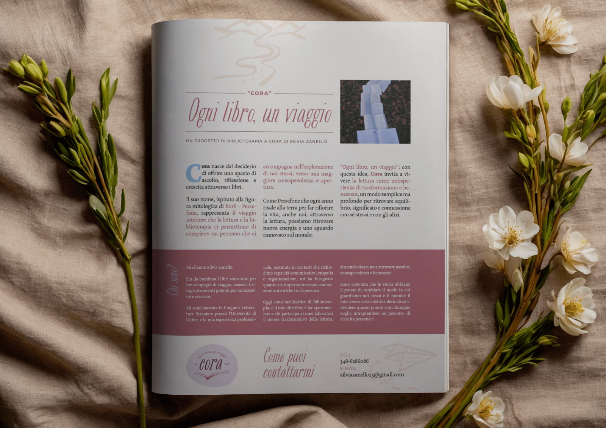
cora - ogni libro, un viaggio
“Cora” è un progetto di biblioterapia creato da Silvia Zanello, un metodo che utilizza in modo ragionato e creativo i libri per favorire la crescita personale e il benessere emotivo e nasce dal desiderio di offrire uno spazio di ascolto, riflessione e crescita attraverso i libri.
Il suo nome, ispirato alla figura mitologica di Korē – Persefone, rappresenta il viaggio interiore che la lettura e la biblioterapia ci permettono di compiere: un percorso che ci accompagna nell’esplorazione di noi stessi, verso una maggiore consapevolezza e apertura.
Ho progettato l’identità visiva di Cora con l’intento di trasmettere un’atmosfera femminile, curata e dal fascino un po’ retrò, un viaggio tra le pagine di un libro in cui ritrovare la propria storia. La palette colore ha i toni caldi del rosa antico, ocra e cipria - con qualche nota di azzurro - mentre il font del logo richiama quelli dei libri vintage. Allungato e un po’ sbavato, evoca la stampa tipografica su carta uso mano.
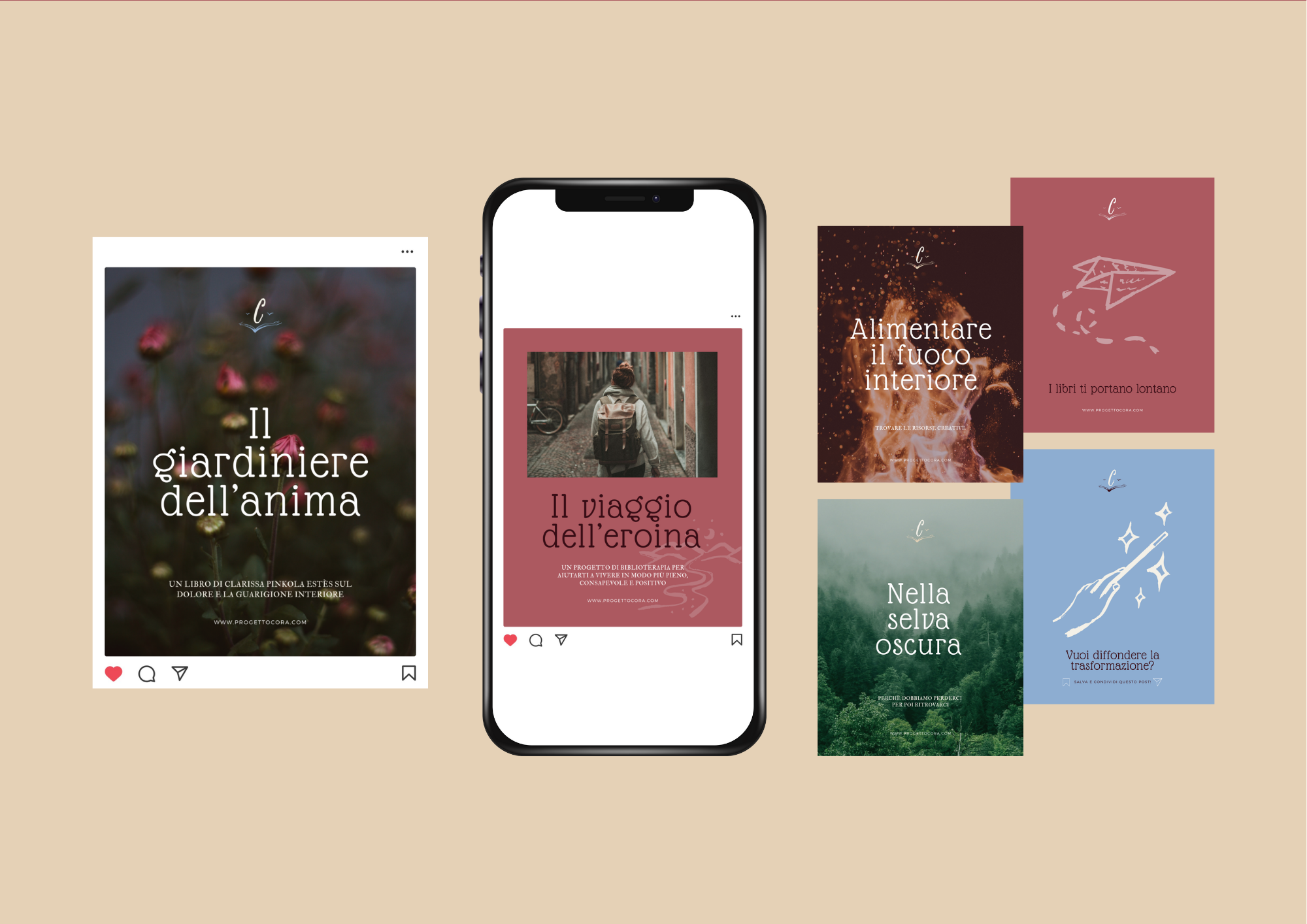
L’ elemento principale del marchio fonde l’immagine di un libro aperto con il volo di un gabbiano, ovvero libertà, leggerezza ed evoluzione attraverso la lettura. Completa il progetto un set di 10 illustrazioni ad inchiostro - da usare in tutte le applicazioni, dagli sfondi ai post sui social. Ho disegnato i temi principali del progetto: la scrittura, il viaggio, la fioritura personale, l’esplorazione, le radici, la trasformazione, ma anche l’amore e il nutrimento. Queste immagini sono perfette per sottolineare i concetti e raccontare le attività fatte durante gli incontri dal vivo.
—————————-
Cora is a bibliotherapy project created by Silvia Zanello: a method that uses books in a thoughtful and creative way to promote personal growth and emotional well-being. Cora was born from the desire to offer a space for listening, reflection and growth through books.
Its name, inspired by the mythological figure of Korē – Persephone, represents the inner journey that reading and bibliotherapy allow us to take: a journey that accompanies us in the exploration of ourselves, towards greater awareness and openness.
I designed Cora's visual identity with the intention of conveying a feminine, refined atmosphere with a slightly retro charm, like the pages of a book where you can find your own story. The colour palette features warm tones of antique pink, ochre and powder pink – with a few hints of blue – while the logo font is reminiscent of vintage books, elongated and slightly smudged, evoking letterpress printing on handmade paper.
The main element of the brand combines the image of an open book with the flight of a seagull, symbolising freedom, lightness and evolution through reading. The project is completed by a set of 10 ink illustrations - to be used in all applications, from backgrounds to social media posts. I drew the main themes of the project: writing, travel, personal growth, exploration, roots, transformation, but also love and nourishment. These images are perfect for emphasising concepts and recounting the activities carried out during the live meetings.
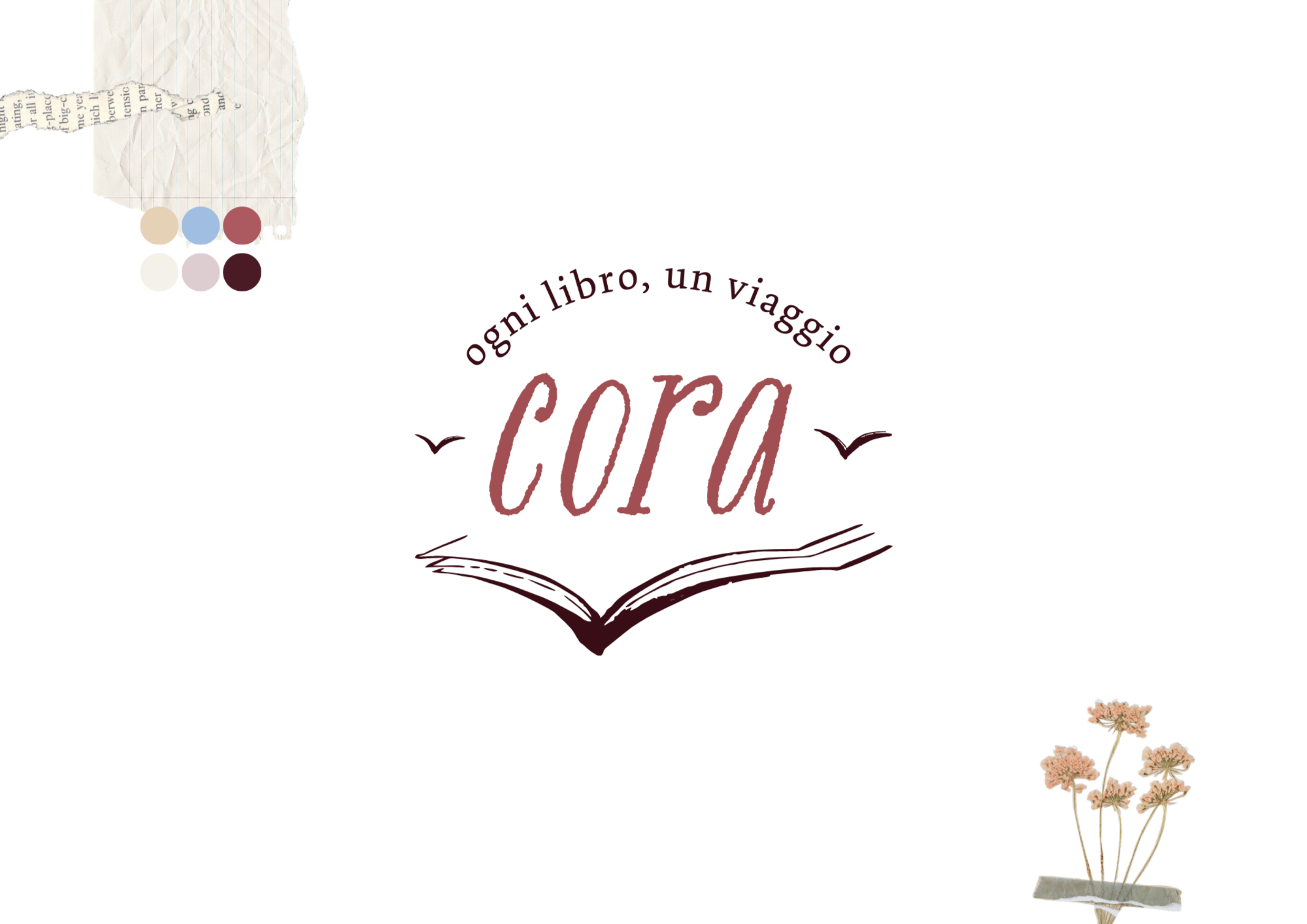
Il logo di Cora, ispirato ai libri e all'idea di un volo libero
Monogramma da usare anche come icona social
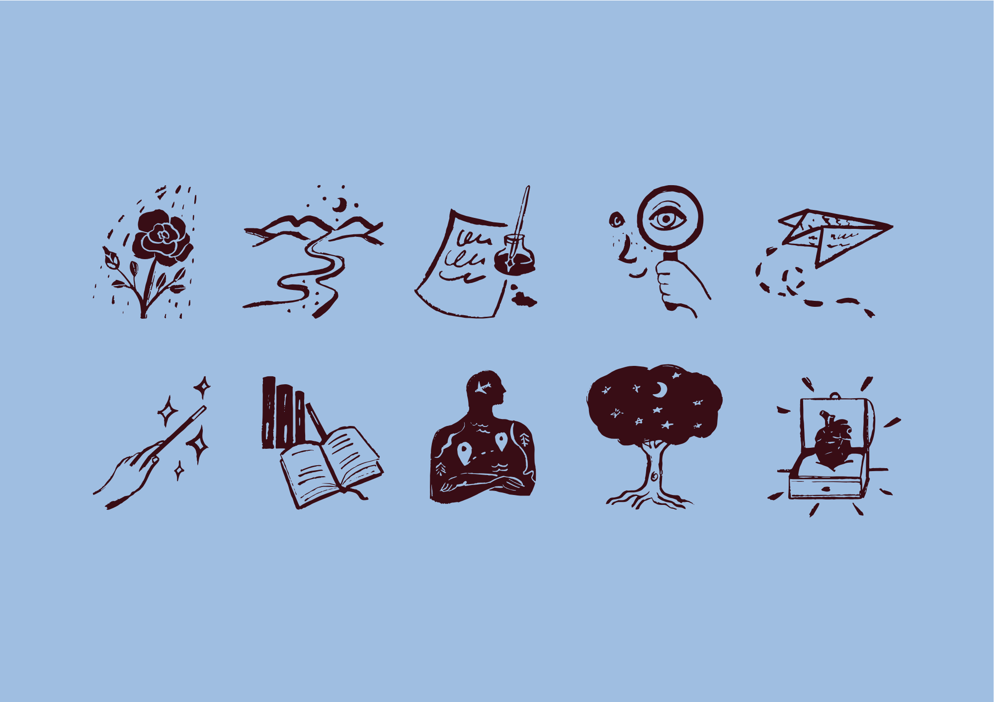
Un set di 10 illustrazioni ispirate ai concetti principali su cui lavorare con la biblioterapia
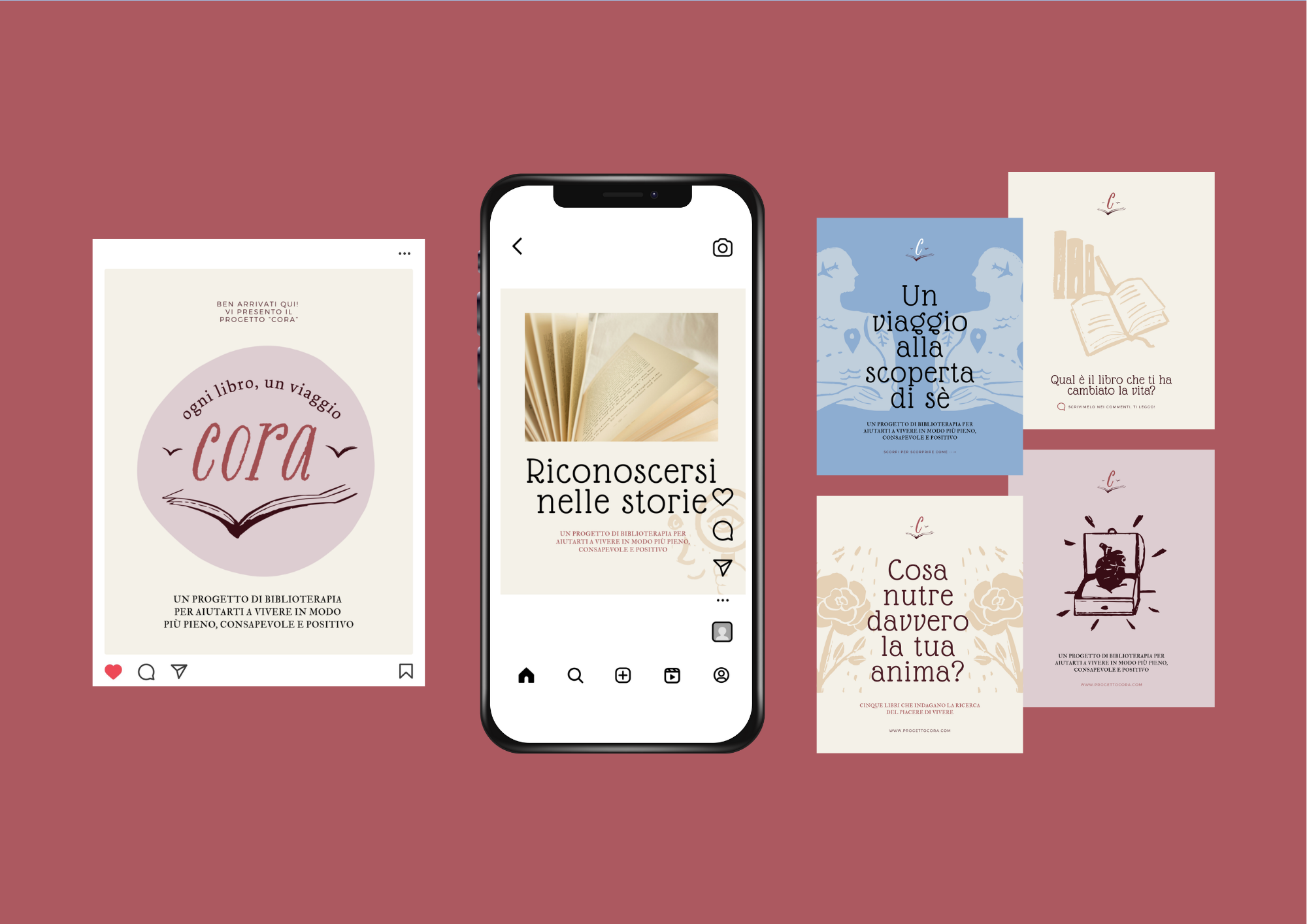
Template grafici per i post social
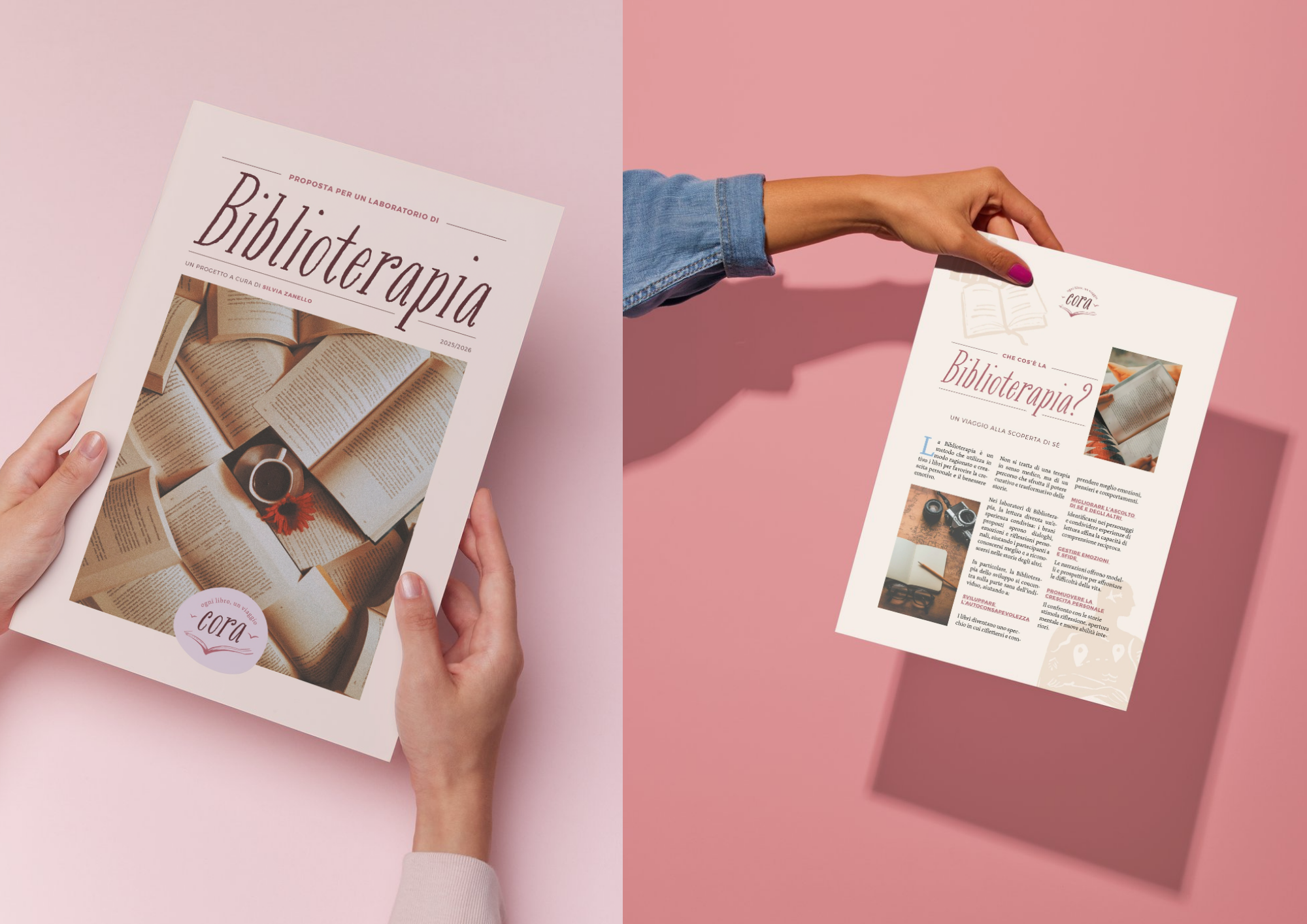
Layout grafico per presentare il progetto agli enti locali ed avviare incontri dal vivo